As was already stated in one of the previous articles, making decisions is probably the most important task of the Board of a multinational organization. Some studies have shown that an average person can make up to a baffling 35,000 decisions per day and members of the Board would not be different. These decisions are made based on the vast amount of data that is produced and collected by a company or business. Most of that data is in tabular format with the tables consisting of thousands of rows and thus being very hard to process. Effective data visualization helps the board to interpret data and make the right decisions.
OneStream XF is a corporate performance management (CPM) platform that aligns with the business needs of customers to support financial reporting, planning, budgeting and other operational aspects of an organization. OneStream XF helps to make data more understandable by aggregating and transforming it to the level of granularity needed. The platform can also significantly help the decision makers by providing a visual insight into the data via the dashboarding and reporting functionality embedded in the tool.
Why is data visualization important?
Data visualization is the representation of data and information in a graphical format. The idea of presenting data in the form of pictures comes to us from prehistoric times and the cave drawings of our ancestors. Through the centuries it has been refined and improved with the invention of maps in the 6th century BC, creation of first graphs and charts in the late 18th century and development of advanced data visualization techniques and tools of the 21st century.
Along with that, a variety of research has been conducted on how people process information. One of the findings is that human beings retain 80% of what they see, 20% of what they read and a mere 10% of what they hear (Paul Martin Lester, “Syntactic Theory of Visual Communication”). The visualization below demonstrates the difference in data retention rates.
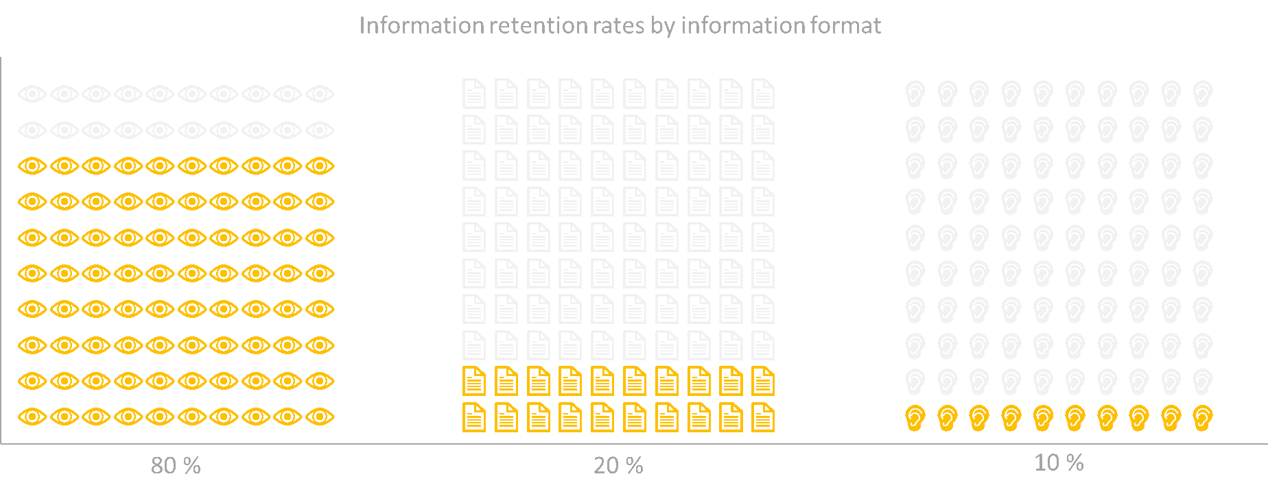
This indicates that we are much more likely to comprehend data if it is presented in a visual format rather than in the form of text or audio. To go further, the same studies indicate that 90% of the information that’s sent to our brain is visual.
What defines a data visualization as good?
It is important to clarify that “the purpose of visualization is insight, not pictures”, as the American computer scientist and Ben Shneiderman in one of his interviews. Based on his fundamental research in the field of human-computer interaction, the data scientist believes that “information visualization is a powerful interactive strategy for exploring data, especially when combined with statistical methods”. Data visualization provides a way for ordinary people to better understand, gain insights and notice patterns in the vast amounts of data available if it is visualized properly.
What is proper data visualization? The following characteristics of a good data visualization can be outlined:
- The visualization should have a clearly defined analytic purpose and it should be designed with a specific audience in mind
- The information should be accurately presented based on correct, reliable data
- The data behind a visualization should be fully available for inspection
- The visualization should be beautiful and have an aesthetically pleasing design
The last characteristic is not objective and a data visualization enthusiast Alberto Cairo states that a visualization cannot be just beautiful or not, but rather it should be perceived as beautiful by as many people as possible.
How can OneStream XF enable great data visualizations?
Now that we have established that data visualization helps in the decision making process and outlined the key qualities of a good data visualization, we need to see if and how OneStream XF can enable such data visualizations.
Clear analytic purpose and target audience
Defining the analytic purpose of a visualization and outlining a specific audience for that visualization is not something that OneStream XF can influence directly. However, the tool does allow to separate dashboards and reports into groups and separate these groups via a robust security system. That way various users of the systems will have access only to visualization elements that were specifically designed for them.
Reliability and integrity of presented data
OneStream XF is positioned as a unified platform that encompasses all aspects of a corporate performance management solution.
The software supports integration with a variety of source systems and acts as a single point of truth for all imported data. All users working with OneStream XF will be accessing the same data as it is stored in a central database. To further ensure integrity and reliability of data OneStream XF's Origin dimension is pre-built with the financial intelligence to deliver transparency, auditability and data protection for complete confidence and compliance. Thus any visualization made on top of data from OneStream XF has reliable data as a source.
Availability of visualized data for deeper inspection and analysis
Once the data is in OneStream XF, users can access it for any kind of analysis that they require. On top of that OneStream XF provides an opportunity to drill down on any data point to see the underlying figures on a more detailed level. To go even further, the solution provides the drill back functionality. Data can be loaded to OneStream XF on an aggregated level of detail but if users want to see the detail behind the aggregation (for example transactional detail) then they can drill back to the source system for that detail. The required detail will remain in the source system but users view that detail from within OneStream XF.
Beautiful and aesthetically pleasing design
As was already mentioned earlier, beauty is a subjective quality, so we will focus on how OneStream XF enables the creation of beautiful visualizations. One of the aspects of the single platform behind OneStream XF is the reporting and analysis functionality that “delivers the right information, in the right format, at the right time with a single platform for financial, statutory and management reporting and analysis”. The clients of OneStream XF can make use of the following features:
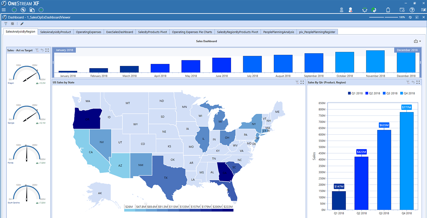
- Interactive Dashboards provide many various tools to create a beautiful and insightful visualization
- Analytic Blend provides the ability to pull operational data into OneStream along with financial data thus enabling more comprehensive and detailed visualizations
- Excel integration allows to pull data from the system into Excel for deeper analysis and quick answers
- Microsoft Office Blend enables using live OneStream data in Microsoft Word® and PowerPoint® documents to present it to key stakeholders
These tools within OneStream XF enable a creative mind to produce the beautiful visualization that their company needs.
Interesting developments of OneStream XF in the area of visualization
If we look at the latest development in OneStream XF in the area of data visualization, reporting and dashboarding, we can see that the functionality is being expanded and enhanced rapidly. The two most interesting additions to the platform that enable visualization of both data and process are the Business Intelligence package and the task manager.
Business Intelligence package
The 5.2 release in October 2019 brought us the Business Intelligence package with the BI Blend Engine and the BI Viewer component. This release enabled the pulling in and processing of large amounts of non-financial data without polluting the financial model. The second release? provided a robust drag and drop dashboarding functionality and made the creation of great data visualizations easier, faster and more flexible. The BI Bend Engine was then further enhanced in the 5.3 and the 6.0 releases providing additional capabilities and improved performance. Some of our customers are already using the new BI functionality to enhance their OneStream experience.
Task manager
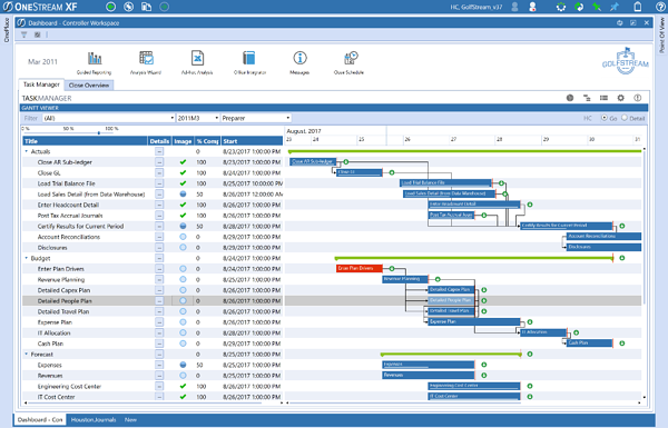
Another addition was the task manager in 2017 which provided a great way of combining all steps of a company’s financial process in one place with an easy way of outlining the process via Gantt charts and various administrative dashboards. The task manager has since been enhanced and is now a robust process management utility available to all clients.
The task manager does not focus on visualizing data but rather on visualizing the process. It does a great job of presenting the monthly close in a clear and easy to track manner and provides a central control pit for managing that process.
Conclusion
This article outlines what data visualization is and why it is so important for the decision making process. Simply put, a human brain processes and retains visual information a lot better than textual or tabular data.
We provided key characteristics of successful visualizations that we follow ourselves during reporting and dashboarding projects for our clients: clear analytic purpose and target audience, reliability and integrity of presented data, availability of visualized data for deeper inspection and analysis, beautiful and aesthetically pleasing design.
We also went over the data visualization enablers that OneStream XF already has as well as their current developments.
About the author: Petr Fedotov

Petr has over 7 years of experience working in the area of Enterprise Performance Management consultancy. He has experience with EPM projects in the oil and gas-, manufacturing- and banking industry and has worked with SAP BPC 10.0, Oracle Hyperion FDMEE, Oracle HFM and OneStream XF.
In his role as EPM Consultant at Agium EPM he helps clients in transforming and improving their finance function by implementing and configuring financial consolidation, planning and budgeting environments with the use of OneStream XF.
Are you interested in enabling your company’s decisions through great visualizations? We are always interested in having an exploratory call to discuss your situation.